


- Block letters are bold, modern, and geometric — best for minimalist, streetwear, or statement styles
- Script letters are flowing and romantic — ideal for feminine, boho, classic, or elegant outfits
- Block fonts read more clearly at larger pendant sizes; script shines at smaller, dainty scales
- Layering works with both, but mixing block and script together creates intentional contrast
- For gifts, script is the safer emotional choice; block is better for someone with a bold, modern taste
- Bubble letters offer a third option — playful and rounded, somewhere between the two
When you're shopping for a personalized initial necklace, the font isn't a small detail — it's the whole personality of the piece. A block letter initial necklace and a script initial necklace look completely different on a person, pair with different outfits, and say different things about the wearer. The good news: once you know what each style stands for, the choice becomes obvious. This guide walks you through every angle so you can pick with confidence.
What's the difference between block and script initial necklaces?
At the most basic level, it comes down to the letterform itself.
Block letters (also called gothic or sans-serif) use clean, straight lines and geometric shapes. The letter "A" in block looks like a solid, balanced capital letter — no flourishes, no curves beyond what's needed. The edges are crisp. The weight is even across the whole pendant. You can read it from across the room.
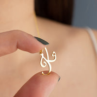
Script letters (also called cursive or handwritten) use flowing lines that mimic handwriting. The same "A" in script has loops, tapered ends, and swells where the pen would naturally press harder. It's lighter in visual weight and more intricate up close. Some script fonts lean calligraphic and formal; others look like casual handwriting.
The key visual difference: block letters look carved or stamped. Script letters look written. One says "modern." The other says "personal."
Block vs Script Initial Necklace: Full Comparison
| Feature | Block Letter | Script / Cursive |
|---|---|---|
| Visual style | Bold, geometric, modern | Flowing, romantic, delicate |
| Personality vibe | Confident, strong, minimalist | Soft, personal, elegant |
| Outfit pairing | Streetwear, blazers, minimalist basics | Dresses, boho tops, feminine cuts |
| Readability | High — very clear at a glance | Lower — best appreciated up close |
| Pendant size options | Works at any size, best at larger | Works best dainty/small to medium |
| Layering ease | Strong anchor piece or clean top layer | Delicate middle or bottom layer |
| Best for occasion | Everyday, casual, statement events | Date night, weddings, formal gifting |
Block letter initial necklaces: who they suit and how to style them
A block letter initial necklace is the choice for someone who wants their jewelry to read clearly and make a point. If you gravitate toward neutral palettes, clean silhouettes, or pieces with structure, block is your font.
Style it with:
- A fitted white t-shirt and high-waisted jeans — the pendant becomes the focal point
- A structured blazer over a bodysuit — block letters complement sharp tailoring
- Athleisure and streetwear looks where the boldness adds edge without clashing
- Turtlenecks and minimal knits where the letter floats cleanly against a plain background
Block letters also work better at larger pendant sizes. If you want a 20mm or 25mm initial that makes a statement from a distance, block is the only font that holds its shape without looking heavy or clunky. Script at large sizes can look overcrowded with loops.
Personality match: block suits someone who's direct, confident, and prefers function over fuss. You don't need a lot of jewelry — just one piece done right.

Script initial necklaces: who they suit and how to style them
A script initial necklace has built-in intimacy. The curves and tapered strokes make it feel like something personal — a gift, a memory, a signature. It's no coincidence that most sentimental jewelry uses script fonts.
Style it with:
- Flowy midi dresses, wrap tops, or linen pieces where the delicacy feels at home
- Feminine blouses with open or V-necklines — the pendant sits beautifully against exposed skin
- Boho outfits with layered fabrics and natural textures
- Wedding guest attire or bridal shower looks where something delicate is the right call
Script pendants usually run smaller than block equivalents — the loops and tails need fine metalwork. Most range from 12mm to 20mm. That dainty scale is part of the charm, but it does mean script reads better in person than from a distance.
Personality match: script suits someone romantic, sentimental, or with a classic feminine aesthetic. It's also the go-to for people who want jewelry that feels personal rather than decorative.
Bubble letter necklaces: the third option
If block is bold and script is elegant, bubble letters sit in their own lane — playful, rounded, and unapologetically fun. Bubble letters have the visual weight of block but with soft curves instead of hard edges. They're popular in gold plating because the rounded shapes catch light from every angle.
Bubble letter necklaces aren't the same as block. Block has flat, geometric edges. Bubble has thick, pillowy outlines. If you want something that reads clearly and still has personality, bubble is worth considering — especially at larger pendant sizes.

How to choose based on your personal style
Here's the fastest way to decide. Pick the description that fits you most:
| Your style | Best font | Why it works |
|---|---|---|
| Minimalist | Block | Clean lines match minimal aesthetics exactly |
| Romantic | Script | Flowing curves feel soft and sentimental |
| Edgy / bold | Block or Bubble | Both have strong visual weight and hold attention |
| Boho | Script | Organic, handwritten feel matches boho textures |
| Classic / elegant | Script | Timeless calligraphic style reads as refined |
| Sporty / casual | Block | Simple and durable-looking — doesn't feel out of place |
The one caveat: if you're drawn to both, script tends to be more versatile for everyday wear because its smaller scale doesn't compete with bold outfits. Block is more specific — it looks best with outfits that complement its directness.
Layering initial necklaces: does block or script layer better?
Both fonts layer well, but they behave differently in a stack.
Block letters as anchor pieces: A bold block initial at 18"–20" becomes the statement pendant in a multi-chain stack. Pair it with a plain chain at 16" above and a simple bar necklace at 22" below. The block letter holds the eye without needing anything else to compete.
Script letters as mid-layer pieces: A delicate script initial at 16"–18" fits naturally in a layered look between a choker and a longer chain. Its fine detail adds texture without visual noise. Two script initials at different lengths (say, your first and last initial at 16" and 18") is a classic combination.
Mixing block and script together: This works as intentional contrast. Keep the metals matching and the chain weights complementary. A chunky block pendant at 20" with a thin script pendant at 16" creates visual interest without looking random.
For a deeper guide on font choice when building a layered initial necklace stack, see our complete initial necklace layering guide.
Font choice for gifts: how to pick the right style for someone else
Buying an initial necklace as a gift adds one more variable — you're choosing for someone else's taste. Here's how to think about it:
Choose script if: The recipient wears feminine, classic, or romantic styles. It's their birthday, wedding, or a sentimental occasion. You want the piece to feel personal and thoughtful. Script carries emotional weight that block doesn't.
Choose block if: The recipient has a bold, modern, or minimalist aesthetic. They wear structured outfits, streetwear, or minimal jewelry. They've mentioned wanting something that makes a statement. Block suits someone who wears their personality on the outside.
When you're not sure: Script is the safer bet for gifts. It reads as elegant and intentional across more style preferences. Most people — even those who don't typically wear delicate jewelry — appreciate a script initial necklace as a gift because of the emotional resonance.
If you know the recipient well enough to know their font preference, that's always the best path. But when in doubt, script wins for gifting.
Does pendant size affect font choice?
Yes — significantly. Font and size are linked in ways most people don't consider before buying.
Large pendants (20mm+): Block and bubble fonts hold their shape and look intentionally bold. Script at large sizes can look heavy — the loops and tails fill in and lose their delicacy. If you want a large initial pendant, go block or bubble.
Medium pendants (14mm–20mm): Either font works. This is the most versatile size range. Block looks confident; script looks refined. Both read clearly at this scale.
Small / dainty pendants (under 14mm): Script is the better choice here. The fine lines and curves come through beautifully at small sizes, and the result is an elegant, barely-there look. Block at very small sizes can look like a filled-in square — the geometric detail disappears.
If you're choosing between a 10mm and a 15mm initial necklace in script, go with the 15mm so the letterform is still legible. If you're choosing a 22mm block pendant, you'll be happy — block shines large.
Frequently Asked Questions
What is the most popular style for initial necklaces?
Script is the most popular initial necklace style overall, largely because it's been the default for fine and fashion jewelry for decades. Block letter styles have surged in popularity since 2022, driven by streetwear influence and minimalist jewelry trends. Both are mainstream now — it comes down to personal taste.
Is block or script more trendy right now?
Block letter initial necklaces are having a strong trend moment as of 2025–2026. Bold, chunky gold initials — including block and bubble fonts — dominate social media and celebrity jewelry looks. Script stays evergreen and never goes out of style, but block is currently the more "of the moment" choice.
Can you layer block and script letter necklaces together?
Yes. Mixing block and script in the same stack is a deliberate styling choice that creates contrast. The key rules: keep the metal color the same (both gold or both silver), vary the chain lengths by at least 2 inches, and let one pendant be the focal point. A bold block piece at 20" with a dainty script pendant at 16" works well.
What font looks best on an initial necklace?
There's no single "best" — it depends on your aesthetic. Block looks best for modern, minimalist, and bold styles. Script looks best for romantic, feminine, and classic styles. If you want one font that works across the most outfits, opt for a clean script in gold — it's the most versatile choice.
Is a script initial necklace too old-fashioned?
No. Script initial necklaces are timeless, not old-fashioned. They've been worn by everyone from royalty to celebrities, and they remain a top-selling jewelry style in 2026. The "old-fashioned" label sometimes gets applied to overly ornate Victorian script — choose a clean, modern script font and it reads contemporary.
What does a block letter necklace say about you?
A block letter initial necklace signals confidence and directness. It says you know what you like and you're not worried about being subtle about it. People who choose block letters tend to have a strong personal aesthetic — minimalist, modern, or street-influenced. The pendant is a statement, not a whisper.
What does a script letter necklace say about your style?
A script initial necklace signals that you value the personal and sentimental side of jewelry. It suggests a romantic or classic sensibility — someone who appreciates craftsmanship and detail. Script wearers tend to think of jewelry as meaningful objects, not just accessories. It reads as refined and intentional.
Which initial necklace font is easiest to read?
Block is the easiest font to read at a glance, especially from a distance. The clean geometric lines make each letter instantly identifiable. Script requires more attention — the loops and flourishes can make letters harder to distinguish quickly, especially at small pendant sizes or in photos.
Should I choose block or script for a gift?
Script is the safer gift choice for most recipients because it reads as elegant and emotionally thoughtful across more style preferences. Choose block if you know the recipient has a bold or minimalist aesthetic, or if they've expressed a preference for statement jewelry. When in doubt, script wins.
Are bubble letter necklaces the same as block letter?
No. Bubble letters and block letters look similar from a distance but are distinct styles. Block letters have straight, flat edges and geometric shapes. Bubble letters have rounded, inflated outlines — like the letter has been puffed up. Bubble letters are bolder and more playful; block letters are cleaner and more architectural.
Does the font matter for layering necklaces?
Yes. Block letters work best as the focal pendant in a stack — they're bold enough to anchor the look. Script letters layer more easily as a mid-layer piece because their delicate lines blend with other chains without competing for attention. Mixing both fonts in one stack works when you keep chain lengths and metals consistent.
Final Thoughts
The font on your initial necklace isn't a minor finishing detail — it's the whole character of the piece. Block says modern and confident. Script says personal and elegant. Bubble says playful and bold. Once you match the font to your actual style, the choice feels natural.
If you're still torn: ask yourself which word describes your jewelry style better — "statement" or "delicate." Statement points to block. Delicate points to script. That single question answers it for most people.
Ready to shop? Browse AJLuxe's full range of personalized initial necklaces:
Every piece is crafted in 925 sterling silver with 18K gold plating — hypoallergenic, made to last, and personalized to order.
Written by the AJLuxe editorial team, jewelry stylists and personalized jewelry specialists. Last updated: May 2026.
Sources: Jewelers of America | GIA (Gemological Institute of America)
You Might Also Like

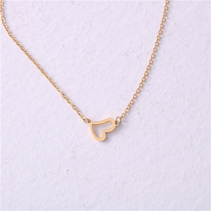

The piece they're describing → Heart Initial Necklace for Women — 18K Gold Plated, Personalized Letter + Heart Pendant
Personalize Yours

